homepages.utoledo.edu/jrabban
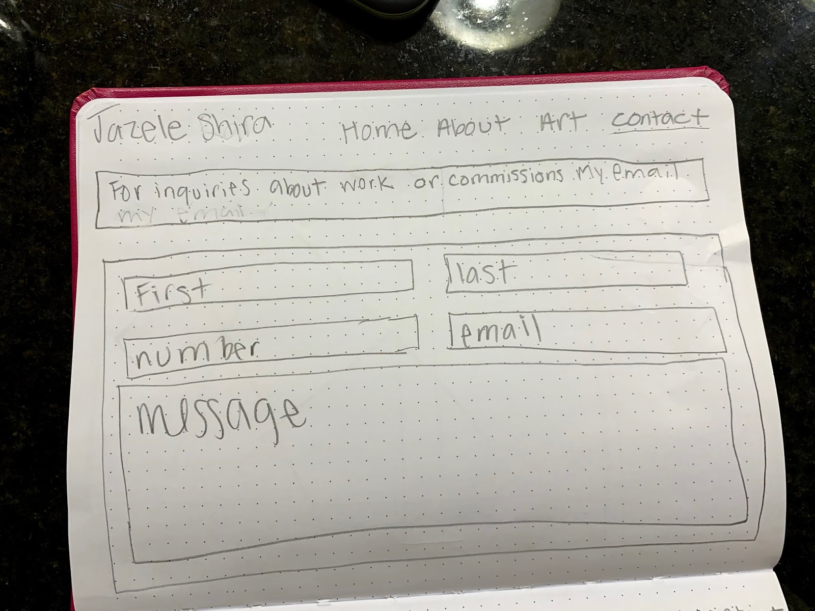
This is my website. I am very proud of the way it came out and I think that it looks great. I was going for a simplistic site with easy usability and i wanted it to be organized in a way that made sense to me. I really like the way i changed my portfolio page and how now you are able to see a thumbnail then click to reveal the series and from there you are occasionally able to get another click into a further detail. I like the colors I decided to use and I also like the way I approached having a text hierarchy. I am completely happy with the way this website appears at this point in my coding career.
Sunday, December 8, 2019
Saturday, November 23, 2019
Response to an interactive art collective (Klip Collective)
Adidas
The first interactive project of Klip Collective that I came across was their "Real-time shoe customization" that they did for Adidas. The link above shows a video of what this project was and how it worked for the user. They installed a giant blank shoe in the Adidas store and users were able to customize their shoe live from an iPad onto the shoe to be able to actually see it in person. The customizations that appear on the installation shoe are moving graphics and there are many options for the user to choose from. I really like the idea of this, because it brings a virtual thing to real life. I think this would be very helpful and useful for the consumer, as well as the fact that they would just like to use it due to it being entertaining.
Nightscape
The next project of theirs I saw was "Nightscape." This is an interactive project in which they projected lights and sounds on an array trees and buildings in Longwood Gardens in Kennet Square, Pennsylvania. Klip Collective really thought out the order the user would experience these scenes and had them specially articulated to be the best experience possible. The use of moving lights and sound that goes along with them seems to me like a very interesting experience that I would like to walk through myself. There is a lake that had projections of fireflies dancing and the trees surrounding the lake all appeared to change seasons by using various color and lighting effects. After this area there is a section of the garden in which the one experiencing has choice, and is able to walk from installation to installation in an order they please. This causes for some variability and more freeness for the user. I think it was very beneficial to start with a very ordered set of things to see which eventually lead to a free space, rather than the whole thing being free space for the user to experience. And once out of the free explore space, there is once again a set of installations that play a certain set of a performance for people to view in one way only. This set is for the people to view and experience as they are exiting the gardens, it gives a great long lasting impression for the people.
We Day
Kilp Collective has also collaborated with The&Partnership to visualize Lynelles story of bullying. She was giving a talk on stage about her experience of bullying in school and how she felt and what she did to overcome it. I think this was an extremely successful project. They were able to create actual visuals that appeared on multiple giant screens behind her while she gave her speech. The visualizations were completely in sync with what she was saying and really helped to move her point across. I believe that it gave the speech a lot more meaning and power by having the visuals isync to watch behind her while listening, rather than just having her solo on stage with a mic to watch and listen to. It almost makes her speech come to life because you are able to watch her story unfold as you hear the words that go along with this story. You are able to feel as though you are living the story, rather than just listening to someone else's story.
This art collective has very interesting ideas that I have never explored before. It was very useful to see what they are doing and how they are doing it. They have many great ideas and they are all very well thought out and planned.
Monday, November 18, 2019
Assignment Four Critique
https://homepages.utoledo.edu/jrabban/islandTime/
Going in to this critique I was looking forward to what people had to say since I already had some ideas of my own as to how I could improve this piece and what I wanted to change. I want to make it so that the rain only works on the down key, not with any key, and that it resets once off the page. Not much more was said about this other than me asking how I would go about doing that and receiving advice as to how. Other than people giving compliments, I got one question as to why the trees are moving, but I enjoy that they change size and that is not going to change. I think I will also go and try to make the clouds change scale as well as they move across as was brought up during last critique.
Going in to this critique I was looking forward to what people had to say since I already had some ideas of my own as to how I could improve this piece and what I wanted to change. I want to make it so that the rain only works on the down key, not with any key, and that it resets once off the page. Not much more was said about this other than me asking how I would go about doing that and receiving advice as to how. Other than people giving compliments, I got one question as to why the trees are moving, but I enjoy that they change size and that is not going to change. I think I will also go and try to make the clouds change scale as well as they move across as was brought up during last critique.
Tuesday, November 12, 2019
response to an interactive project
https://redpaperheart.com/work/heinekeninteractivebar
This is an interactive installation with actual and practical use. This is very interesting and cool to me because it is a bartop that is sensitive to touch. You are able to touch it and parts will light up. You can also draw with your finger on it and it will drag the drawing along with your finger; the design that is drawn I also really like since it is origami pieces rather than just a solid line that would follow you. I also really like the fact that this bartop has a feature that allows you to order another beer. You are able to click on certain spots to alert the bartender that you are in line or want another beer. Also the bartop is able to recognize if a heineken is placed on it, and it creates a series of reactions due to that. I overall think this is a very cool idea and that it was created very well, this is why I like this piece of interactive art.
This is an interactive installation with actual and practical use. This is very interesting and cool to me because it is a bartop that is sensitive to touch. You are able to touch it and parts will light up. You can also draw with your finger on it and it will drag the drawing along with your finger; the design that is drawn I also really like since it is origami pieces rather than just a solid line that would follow you. I also really like the fact that this bartop has a feature that allows you to order another beer. You are able to click on certain spots to alert the bartender that you are in line or want another beer. Also the bartop is able to recognize if a heineken is placed on it, and it creates a series of reactions due to that. I overall think this is a very cool idea and that it was created very well, this is why I like this piece of interactive art.
Monday, November 4, 2019
assignment three critique
Today we critiqued assignment three and i think i was told and got to discuss a few things that will actually help. Amanda brought up that the cursor is able to disappear which i think will make this sketch look even better than it did originally so i am going to change that immediately. Also Haley brought up the island and the tree and changing it in some way. I agree with this and am going to actually draw an island in illustrator and then import in the raster image. I think these two things alone will make a stronger composition. I feel like i did well with this assignment and I'm excited to move forward with it now.
Saturday, October 26, 2019
hello world! processing
This way this video was made was interesting to me because I liked the way that they kept comparing this new age process of processing to when computers first came out. I liked the way that it broke down what is actually happening, and i liked a lot of the simply put references and explanations. It is very true and a great way to explain what is happening by saying that you are thoroughly explaining your ideas to the computer. You make the rules and as long as you explain them exactly how you want and in terms that the editor can understand. At one point in the video there was a woman speaking French and I'm not sure why she was added in there because the whole video was in english and i couldn't understand her. I really want to try out the idea of making a simple set of rules and seeing where that can go when repeated indefinitely. I enjoyed seeing the way that things like that can be made and I'm just wondering how i can do things like that.
Monday, October 21, 2019
first sketch

function setup() {
createCanvas(1400, 700);
}
function draw() {
background(0);
stroke('pink');
strokeWeight(6);
ellipse(250, 200, 500, 30);
rect(60, 40, 60, 30, 5);
background(200,100,175,150);
strokeWeight(3);
stroke('red');
noFill();
rect(100, 300, 200, 75, 5, 10, 15, 20);
triangle(350,10, 300,75, 400,50);
triangle(100,110, 280,120, 110,200);
quad(250,100, 150,30, 350,295, 250,75);
strokeWeight(5);
stroke('blue');
line(500,100, 1200,150);
line(500,100, 1200,200);
line(500,100, 1200,250);
line(500,100, 1200,300);
line(500,100, 1200,350);
line(500,100, 1200,400);
line(500,100, 1200,450);
line(500,100, 1200,500);
line(500,100, 1200,550);
line(500,100, 1200,600);
line(500,100, 1200,650);
line(500,100, 1200,700);
fill('pink');
stroke('orange');
beginShape();
vertex(500,100);
vertex(600,50);
vertex(700,100);
vertex(650,300);
vertex(550,250);
endShape(CLOSE);
fill(220,60,35,255);
background(200, 90);
stroke('purple');
circle(800, 600, 90);
circle(700, 600, 80);
circle(600, 600, 70);
circle(500, 600, 60);
circle(400, 600, 50);
circle(300, 600, 40);
circle(200, 600, 30);
circle(100, 600, 20);
circle(0, 600, 10);
strokeWeight(20);
stroke('green');
point(30,80);
point(30,120);
point(30,170);
point(30,250);
point(30,320);
point(30,480);
fill(92,220,55,150);
stroke(334,59,200);
strokeWeight(5);
rect(1000, 65, 420, 700);
}
Tuesday, October 15, 2019
Assignment 2
homepages.utoledo.edu/jrabban/shapeland
This is my website for assignment two. I am having some difficulties with the way it is appearing online through the sites page compared to how it is when opened from the folder i have on my desktop. For some reason as of right now the sound is not working on the online version of any of my pages and I'm not sure why because they are added in my media folder.
This is my website for assignment two. I am having some difficulties with the way it is appearing online through the sites page compared to how it is when opened from the folder i have on my desktop. For some reason as of right now the sound is not working on the online version of any of my pages and I'm not sure why because they are added in my media folder.
Tuesday, October 8, 2019
garden post
This reading was really interesting because it was all about the idea of having choices and having many different paths. This relates to our assignment because we are making an interactive site that will allow the viewer choice in their own “path” or way that they will experience the site. The story went on and explained how the whole purpose of the garden of forking paths was to get lost in time and that there will always be an infinite amount of choices as to where to go in life or in our case our site.
I have been having a hard time coming up with how i want to create the viewers experience in my site, but this reading helped me realize that whatever way i create this site is right. The assignment has a loose set of guidelines and because of that, comes an infinite amount of choices. From a story telling site, to a build your own, to a maze, or even a purely experimental site, the choices seemed endless. That is why it was so hard for me to come up with what i want to do, but i have decided that i want to make it more about the the viewer getting something from it and for this reason is why i don’t want to do a purely experimental piece. I have been leaning towards a build your own ice cream sundae and in my opinion this is a good theme because the person will have many choices as to what to creat but i will still be the guider and i will have precreated many different path options for the viewer. I like the fact that they know they will be creating a sundae and that at the end they will get to see what their choices created for them.
I have been having a hard time coming up with how i want to create the viewers experience in my site, but this reading helped me realize that whatever way i create this site is right. The assignment has a loose set of guidelines and because of that, comes an infinite amount of choices. From a story telling site, to a build your own, to a maze, or even a purely experimental site, the choices seemed endless. That is why it was so hard for me to come up with what i want to do, but i have decided that i want to make it more about the the viewer getting something from it and for this reason is why i don’t want to do a purely experimental piece. I have been leaning towards a build your own ice cream sundae and in my opinion this is a good theme because the person will have many choices as to what to creat but i will still be the guider and i will have precreated many different path options for the viewer. I like the fact that they know they will be creating a sundae and that at the end they will get to see what their choices created for them.
Tuesday, October 1, 2019
psychogeography
Incorporating psychogeography into contemporary art is the idea of having the art create playfulness and have the viewer be interactive within it and have the ability to drift throughout it. It also has to do with how a geographical location will affect a persons behavior and emotions. If a piece of art puts an idea of a specific location within it, then the viewer will automatically be placed in that location and will have a set of specific emotions and behaviors towards that location.
I went on to a different website to try and understand the purpose and impact of psychogeography a little bit better; and i’m glad i did because this site gave me much more insight in a way i could grasp. It explains how psychogeography started in art work as a way to explore the urban city and world in a way no one had ever imaged before. This type of work had roots that extend from surrealism and other art movements that would break the boundaries and release the ideas of the inner subconscious.
It is very interesting to see how others do this as one example mentioned in this website that i found (tate.org.uk) is of artists, writers and filmmakers such as Iain Sinclair and Patrick Keiller, that used the idea of walking through a location to explore how simply a location affects a persons emotions and experience with a work.
Sunday, September 29, 2019
Critique Response
During the critique I felt as if I was leading the discussion about my website rather than getting actual critical feedback from others, but the class critique was still able to give me help as to what I felt still needed to be worked on. I brought up wanting to put auto margins around the whole page, so I have now done that since the critique. This brought along another issue though that I am not sure on how to fix and I have gone through many many ways to try and resolve it. My "title box" is perfectly aligned with my "main body area" but on the index it is shifted 15px extra from the left compared to all my other pages in which it doesn't move and they never did before the auto margin change. I did go ahead and try to narrow it down my commenting out div by div, but even then it didn't change.
The critique made me want to go back and try to create style without having background colored boxes around div of information. I went in and changed my color scheme, text sizes, and some of the features such as bolds. Another thing that was mentioned was my placement of my contact information. I agreed that it needed to be moved somewhere and I decided that the top of my about page was the best location. Since it is small and can be a quick focus while also making noticeable that the page is a scroll page because someone mentioned that it might get lost at the bottom if people were to not realize it scrolls.
The image on my page I wanted to stay in place while the informational text I have written would be able to scroll. I was having a very hard time doing this so I decided to just make it absolute, but this was before the critique. After the critique and fixing the auto margins it made me really want to figure out how to fix the picture within the div. I tried to do it by using sticky, but I could not get sticky to work or even show up as an actual position type, so I ended up finding a different way and it was through using a "transformation." This actually did exactly what I wanted it to do, but it ended up making it not perfectly align with the right side of the menu how it was before.
So as of now I am happy with what I have so far of my website. The only things as of right now that I want guidance on fixing is the about photo alignment with my menu, and the whole page alignment issue of my index compared to the other two pages.
Wednesday, September 25, 2019
Sunday, September 8, 2019
"The Work of Art in the Age of Mechanical Reproduction"
In Walter Benjamin's essay, "The Work of Art in the Age of Mechanical Reproduction," he made a lot of points about the way technology has affected art. One point he wrote about is how technology has had the ability to cause mechanical reproductions of works of art and this causes many things to happen such as the works of art start to lose their authenticity and uniqueness. Also he mentions new forms of art during that time which included photography and film. One other interesting point he mention was that original works of art have their own individual auras that come along with a specific time, place, and historical context.
I agree with Walter Benjamin that all art has its own aura. Along with this I also do agree that the reproduction of art takes away from this. After looking at a painting, reading a poem or book, listening to a song, or experiencing any form of art the viewer is able to understand where the art came from and the emotions/details transferred within the work; but when a work of any type is reproduced it tends to lose its sense of having its own experience which entails that the reproductions of works do not contain as special an aura as the original is able to.
When this was written in 1936, photography and film were the up and coming technologies in the art world. Walter Benjamin did not seem to like the way that these technologies were also causing for manipulations and reproductions of once original works of art. Although this seems to be a bit unrealistic because people throughout all time have been reproducing works of art of the people before them. The current art history I am in has shown this many times by showing us the many artists who recreated religious works such as: "Christ's Entry into Jerusalem" and "Madonna and Child Enthroned." So for Walter Benjamin to disapprove of the reproduction of work so strongly is something that I have to disagree with. I believe that it is okay to recreate works of art in your own style and that it would just create another new original piece with its own aura without diminishing the authenticity of the first original work. I do although agree that if someone were to deliberately lets say just take a photo of someones else's work and print it off and sell it as their own that it would definitely be taking away from that work of art's originality and causes it to be less authentic and unique which would be unfair to the original artist who actually created the wonderful work.
Overall Walter Benjamin did have a lot of good points on how technology can affect art based on the act of mechanical reproduction. Technology constantly is becoming more advanced and as this happens it becomes easier and easier to reproduce works of art.
Tuesday, September 3, 2019


Tuesday, August 27, 2019


Monday, August 26, 2019
artists websites
https://callenschaub.com
I really like the work that this artist produces. I love the colors and movement that each piece uniquely expresses. Also I like the process used and i like how he decides to show that and have it become art within itself. His website I like because it stylistically does a great job at representing him and his art. Also his website has a tab for everything up top so that it is well organized and easily accessible. Another thing i like is that everything about him and his work is included in the website there is nothing i could be looking for and not find.
http://charmaineolivia.com
So what i love about this artist is that she produces very large works and she uses a million layers of translucent symbols and strokes in her paintings; but this website does not show any of this at all. Also she uses very vibrant colors and when her website opens up it is of one of her colorful works of art, but then you go over to her about page and it is very plain just grey and white. I do not like this because it doesn't represent her very well in my opinion.
https://shantellmartin.art
This artist's website has a very interactive home page which i think is rally cool and different. This is the main reason i like this website; its also well organized but i don't really like the pull out menu or a few of the tabs because they are confusing. The info tab is awesome and I really like that she wants to build a relationship with anyone who wants to be a collector of her art. I enjoy her art because its simple and sketch looking with lines that just keep going and going to become faces and shapes.
Tuesday, April 30, 2019
assignment five
This is my final zine, and i am able to say that i am very proud of what i have done. I like the way it looks and i have enjoyed working with indesign to create it. I learned a lot about how to layout pages and also about font size and leadings. I liked being able to create something I'm passionate about in a way like this where i was able to put down all the information i wanted in whatever style i chose for the zine.
But overall I did like this assignment and I really have liked using indesign and want to use it again soon


Monday, April 15, 2019
Assignment four


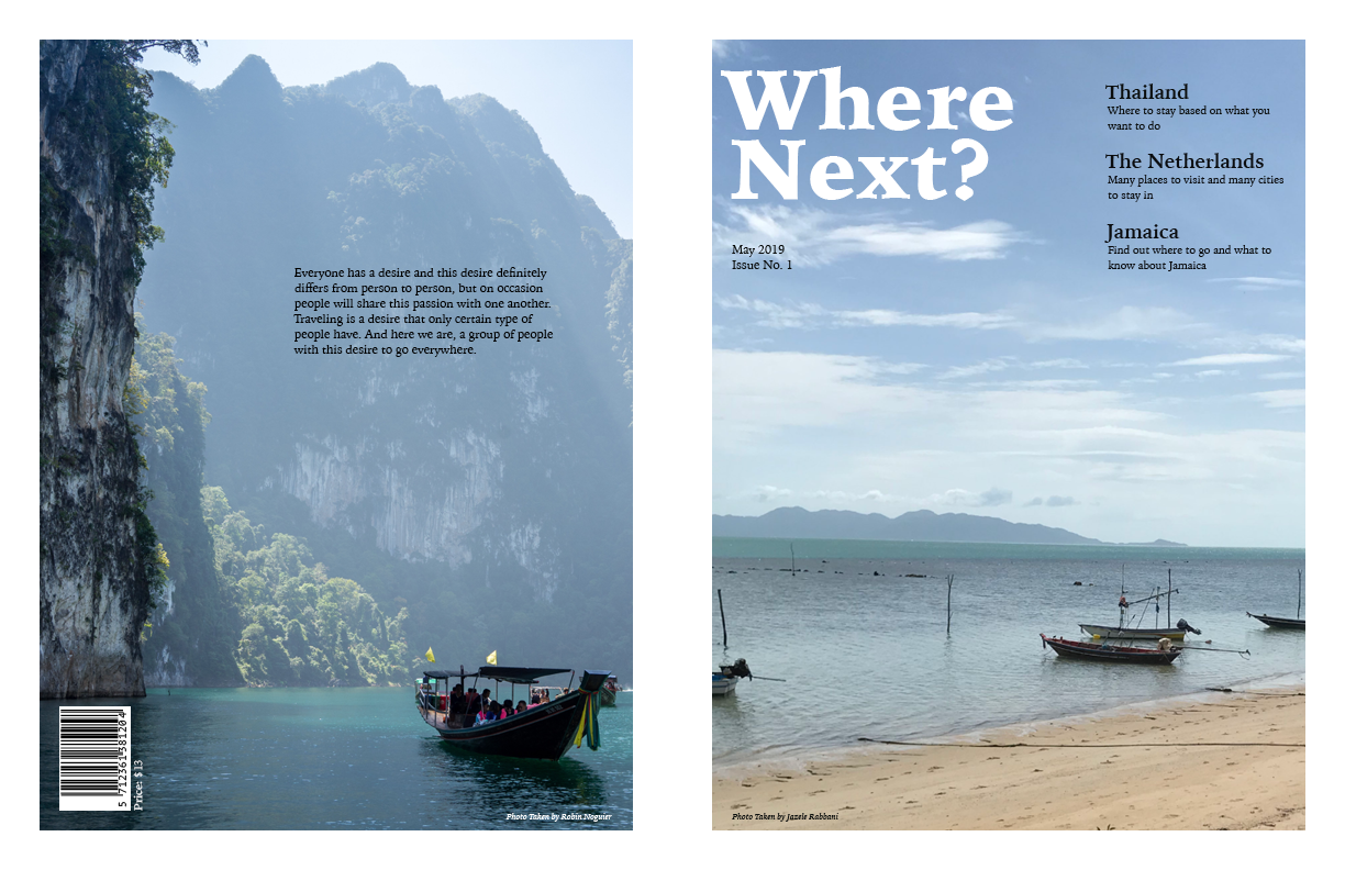
These are two of my layouts of pages of for my travel zine. I wanted there to be variety between the layout of each page while still incorporating similar colors from one page to the next to have a feel of some sort of flow. I played around with one font family and all of its' variants, as well as manually manipulating the leadings to my liking. The captions I may still work on to give some more breathing room between each line, whether that be to change the font size or the leading.
Monday, April 8, 2019


Wednesday, April 3, 2019


Tuesday, April 2, 2019
12 column grid
This article helps to explain how a grid is used as a basis for any well made design. In order to have good alignment between text and images a grid is necessary. Having a grid allows for there to be specific columns and areas for each piece of information, whether it is text or an image, and therefore specific places for those items to line up with one another. Magazines started to use this idea before there was a program online and a person would have to measure out all the columns, margins, gutters, and everything else by hand with a ruler and paper. A three column grid is a very basic form but can have slight variety with having a picture or text be two or three columns wide rather than fit in the one. In 1988 the 12 column grid was introduced. This type of grid allows for there to be very structured alignment as well as a lot of freedom as to where text and photos can be placed. The 12 column grid allows for the grid to be used as a 2, 3, 4, and 6 column grid all within itself. Also those can be used for different aspects, such as text being used as a 2 column grid while the photos get a 4 column set up all within the 12.


Monday, March 25, 2019


Sunday, March 24, 2019
Oscars
After reading this article I totally agree with the writer of the article. They are right that with a few fixes of typography and design of the Oscar cards they could have prevented the mistake of reading out the wrong card. If it used the idea of having a hierarchy the words "best actress" could have been written much bigger and near the top so they would have seen that immediately. It also makes sense to have the Oscars logo be at the bottom because the hosts announcing the winners know they are at the Oscars and do not have to read that bit of information, it is just extra. The design needed to show the reader only the important information since that is what they will be reading the winner from.
Wednesday, March 20, 2019


Tuesday, March 19, 2019


Saturday, March 16, 2019


Wednesday, March 13, 2019


Wednesday, February 27, 2019


Wednesday, February 20, 2019


Monday, February 18, 2019


Subscribe to:
Comments (Atom)