Monday, October 15, 2018
critic feedback
I like that we do critics because I feel like it helps me make my projects go from being good and finished to looking actually complete. In think that since I'm the one creating the assignment i miss out on small details that need to change. People told me that i need to look at a few things such as changing the font, centering the person, fixing the smoke, and darkening shadows. When i went throughout my "completed" poster, i realized that i did want to change those couple of things. After i changed things such as the position and way the words were i realized that I liked it much more and made it look better and more complete. Without getting this feedback I may not have realized my poster's full potential.
Wednesday, October 10, 2018

Wednesday, October 3, 2018
typography
This reading taught me the different portions of type, and what makes a font specific to itself and how it is unlike any others. There are little aspects that all get put together to become a font. These things include: the contrast in strokes, serifs, vertical axis, horizontal stress, and aperture size. Modern fonts are good but look odd when combined with other non-modern fonts due to how specifically designed modern fonts are. It then goes on to explain when to use what and how they are used in real life. Also compares the subtle differences of four different Didone m's to show how each change affects its appearance. To me, the article was a bit confusing due to the history and the fact that I knew nothing of this before starting to read.


Monday, October 1, 2018
posters
 |
| I love this poster because the black really puts emphasis on the center which is full of colors. The yellow writing stands out and looks so bright in contrast with the background. The image in the middle almost looks like a sun while also looking like theres a compass on the top of it, which to me represents that the vibes from all over the world are gathering. |
 |
| This Bassnectar poster draws your attention in with the bright warm colors like the pinks and oranges and then it contrasts those colors with bright greens and yellows. The poster gets balanced by having plain darkness at the bottom behind the words. |
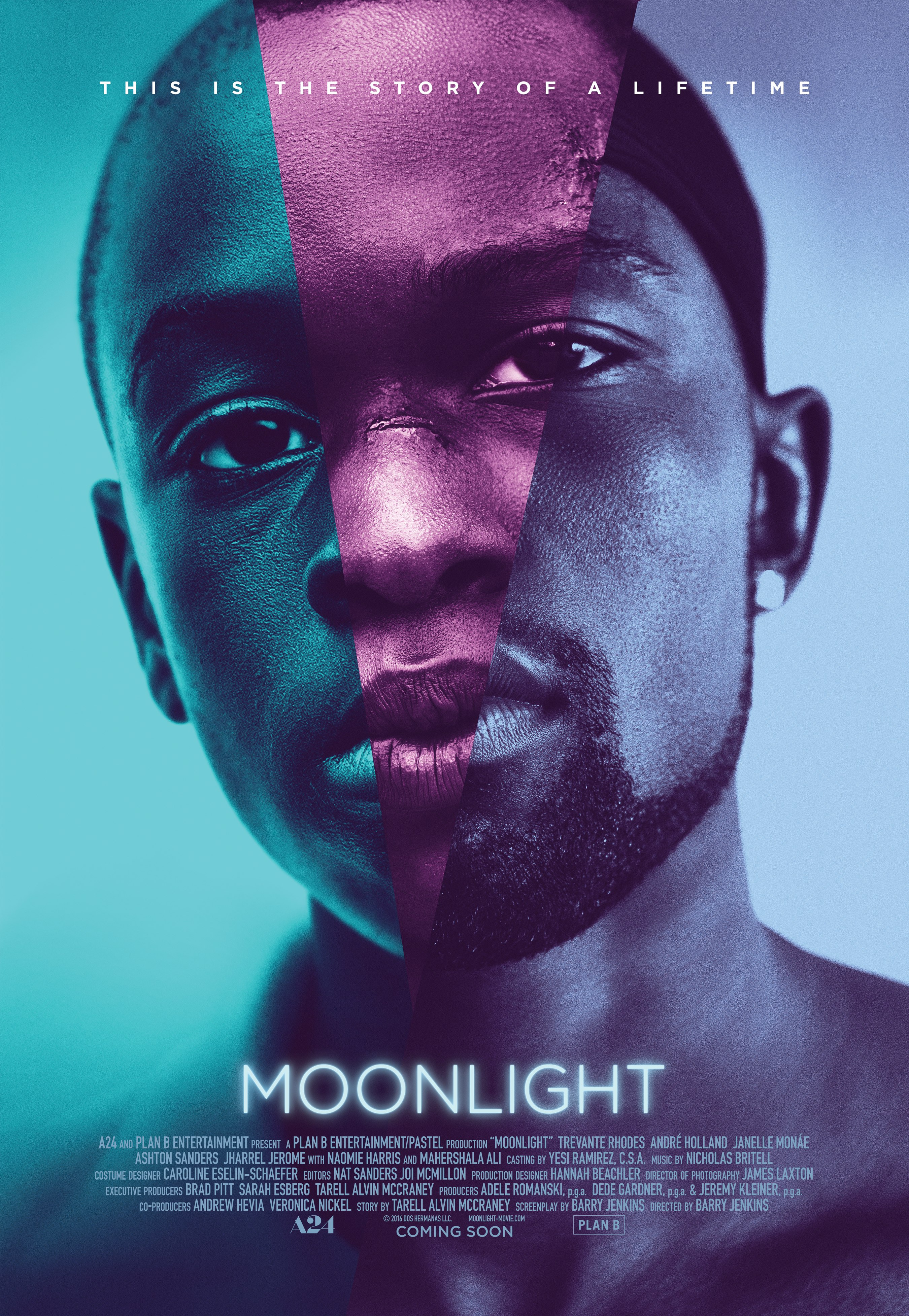 |
| I like this poster mainly due to the color scheme. I think it was a good idea to have a cool analogous scheme over the guy's face. Also the image of the person is the kid growing into the adult that he becomes which is also interesting to me, because i think it shows an insight to the movie. |


Subscribe to:
Posts (Atom)